Benchmarking Reports - Graphs - Excel Charts
Excel Benchmarking Metrics Charts
SCOPE provides over 30 different Charts to enable you to compare your Benchmark Metrics by Period.
The Charts graphically report across Work Packages , Projects, Releases and by Period.
- Size
- Effort
- Defects
- Cost
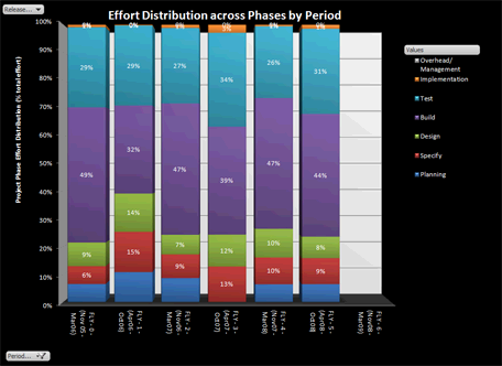
- Effort Distribution by Phase
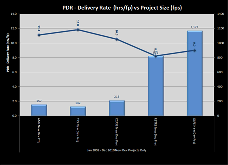
- Project delivery rate (PDR)
- Cost-effectiveness ($/FP)
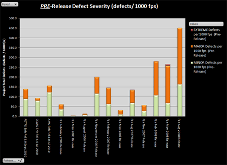
- Defect Density (defects/1000fp)
SCOPE creates an XML extract of your selected data which is automatically into an Excel Workbook and populates the pre-formatted Pivot. SCOPE then opens the Excel Workbook for viewing and editing. For advance instructions on how to edit the Graph see Tutorials
The Benchmark Graphical Reports allow you to select which Benchmark Data you want to report by highlighting one or more nodes the Benchmark Metrics Tree. You can use CTRL and SHIFT to optionally multiple nodes.
Creating Benchmark Graphs
- Select
 Metrics Charts button the top of the screen. The drop down list gives the option reporting Benchmark data as either:
- Maintenance and Support (M&S) Data - reports all the M&S Metrics Data for the Applications at Application and Period level
- Development and Enhancement (D&E) Release Data - reports all the D&E Data for the selected Releases at the Count Session/Work, Release and Period level
- Development and Enhancement (D&E) Project Data - reports the D&E Metrics Data for the selected Projects at the Session/Work Package, Project and Period level
- Select the Report option from the displayed: Note: if the report option is 'greyed out' then it means that your are not located on a node that has that type metrics data under it
- Select a Folder from the "Browse Folder" dialogue box, then press the "Make New Folder" button on the left hand bottom screen. SCOPE will save the exported data extract and new Excel Workbook with the Pivot charts in the, then automatically open the Workbook
- Since the Workbook contains Macros enable the XML to load and display, in order to refresh the data need to Enable the Macros you need to change the security settings the file. This can be done by pressing the Options / Enable button on the Security warning ribbon at the top of the screen. You can also select "Info" under file and follow instructions how to change the Trust settings for the file. Once you have the enabled macro settings you will be able to Open and view the charts
- SCOPE the Microsoft Excel Pivot Chart report functionality. Pivot provide interactive analysis of data, like a Pivot Table report. You can change views of data, see different levels of detail, or reorganize chart layout by dragging fields and by showing or hiding items fields. For more information on how to edit Pivot Charts Customising Excel Charts or to set up your own Template Benchmark Report so you can reuse it all its reporting see Saving New Excel Chart Template